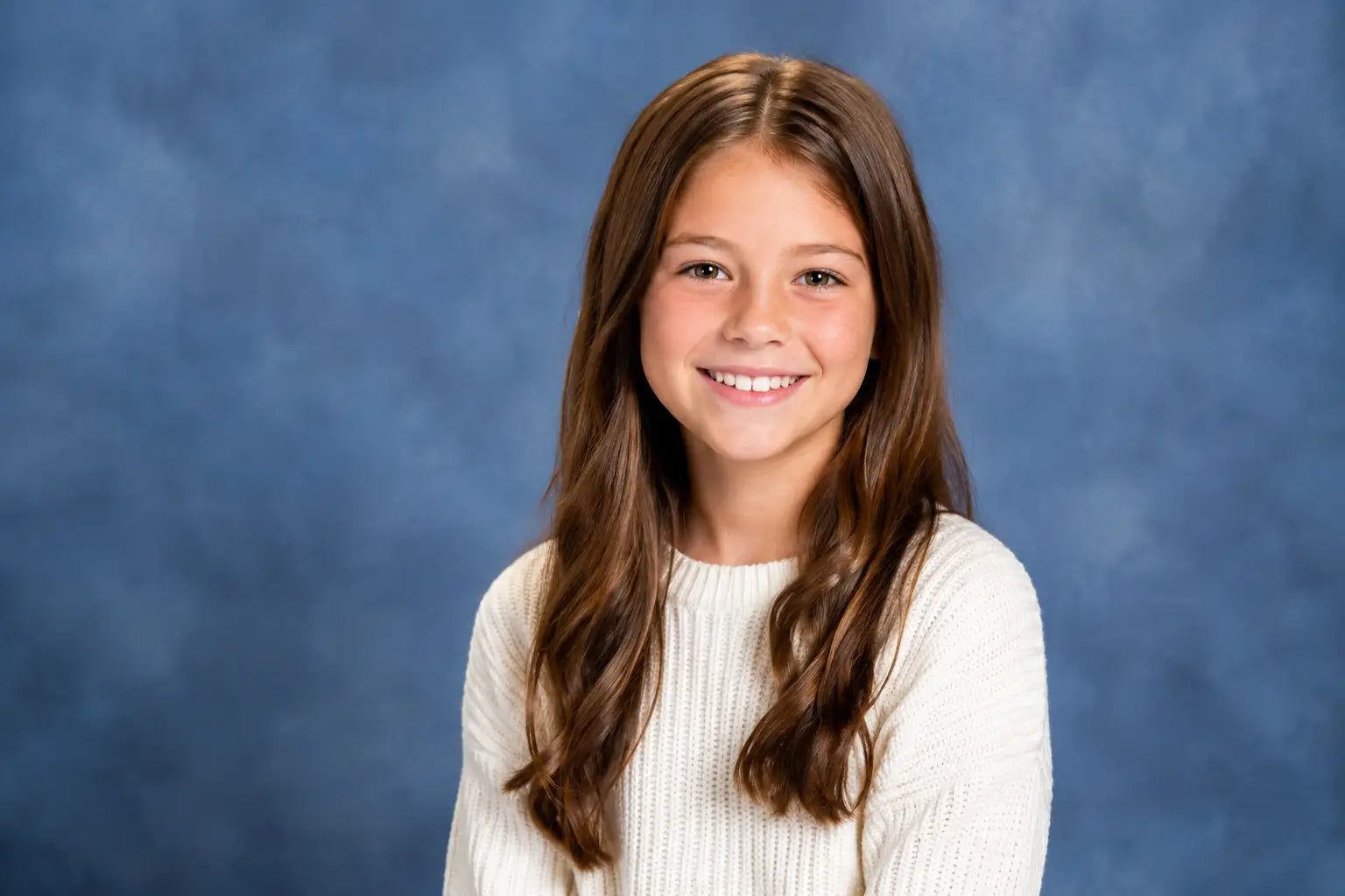























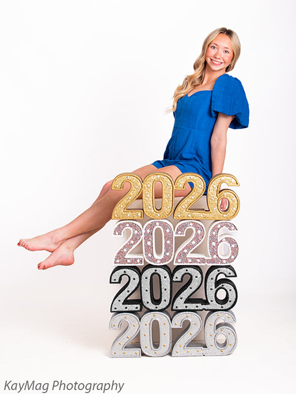








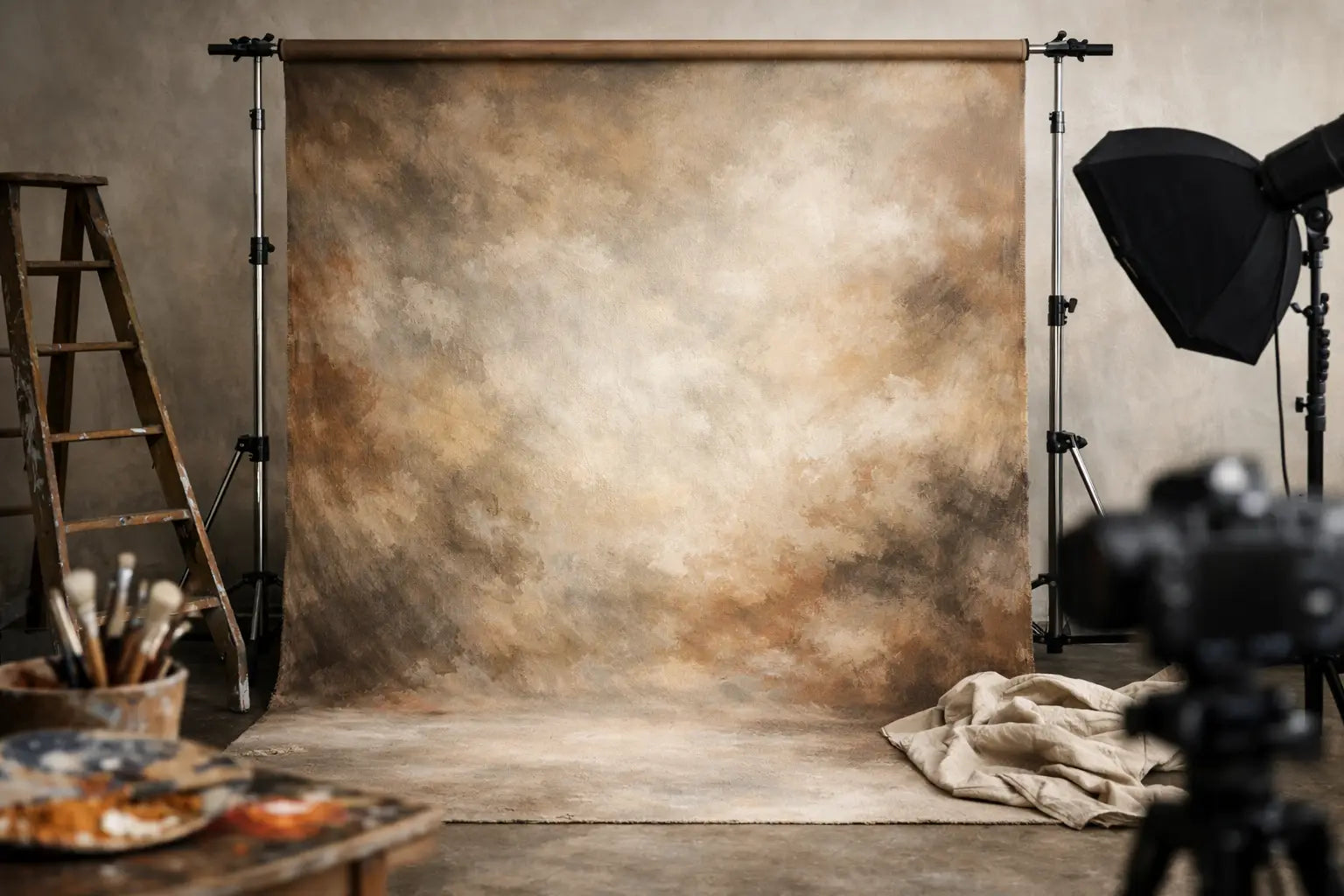

A background can make a carefully lit portrait feel flat before the client ever sees it. Hand painted photo backdrops solve that problem with layered color, natural texture detail, and tonal variation that gives a subject room to stand apart. For working photographers, that means a more intentional image in camera and fewer hours spent trying to build depth with editing alone.
Unlike a perfectly uniform surface, a painted backdrop has movement. Subtle shifts from light to dark help create separation around hair, shoulders, and clothing without competing with the subject. The result can be classic, dramatic, soft, or editorial, depending on the color, finish, and how the backdrop is lit.
Why Hand Painted Photo Backdrops Photograph Differently
A hand-painted background is designed to have variation rather than repetition. Brushwork, mottled layers, feathered edges, and restrained changes in tone give the camera something natural to render. This is especially useful in portrait work, where a background should support the subject without looking like a flat wall behind them.
That variation also changes how the backdrop responds to light. A matte, non-reflective finish photographs true without glare, allowing photographers to use directional light, broad soft light, or controlled rim light without fighting hot spots in the background. When the finish is properly managed, the texture remains visible but does not become distracting.
The difference is most noticeable when a subject is positioned several feet in front of the background. With enough distance, a wider aperture softens the brushwork into a believable field of color while retaining enough tonal character to give the portrait dimension. Bring the subject closer, and the texture becomes more present. Neither approach is wrong, but the choice should match the session style and the lens being used.
For headshots and executive portraits, a quiet neutral painted surface can add polish without pulling attention from the face. For seniors, fashion-inspired portraits, dancers, and musicians, deeper or more expressive tones can create a stronger visual point of view. Family, children’s, and fine-art portrait photographers often use softer painted designs to keep skin tones and wardrobe at the center of the frame.
Choose Color for Skin Tone, Wardrobe, and Light
The right color is rarely just a matter of preference. A backdrop has to work with the client’s skin tone, clothing palette, set props, and lighting direction. A medium gray or warm neutral is flexible because it can shift noticeably under different lighting setups. Add a cool key light and it may read more slate or blue. Use warmer light and it can become more taupe or charcoal.
Dark painted backdrops create a controlled, dramatic look, but they require attention to subject separation. Dark hair, black wardrobe, and a low-key background can blend together if the light is not placed deliberately. A subtle edge light, a brighter section of the painted pattern behind the subject, or a slight change in posing can restore definition without making the image feel overlit.
Lighter backdrops bring a different set of decisions. They can produce clean, airy portraits and work well for children, maternity, beauty, and commercial work. However, they may need more careful exposure control when photographing pale wardrobe or high-key subjects. The goal is to preserve texture in the backdrop while keeping highlights on the face and clothing where they belong.
Color temperature matters as well. If the backdrop leans warm and the key light is noticeably cool, the contrast may look intentional or it may make skin appear disconnected from the scene. Test the background under the lighting you use most often. A quick reference frame with a gray card can help establish a consistent starting point for each session.
Select a Size That Supports the Way You Shoot
Backdrop size affects more than the width of the frame. It determines how freely you can pose, whether you can turn a subject sideways, and how much room you have to crop for vertical and horizontal deliverables. A backdrop that works for headshots may feel restrictive for three-quarter portraits, seated poses, or family groups.
Start with the largest composition you routinely need. If you photograph individuals primarily from the waist up, a narrower width may be practical in a compact studio. If you photograph couples, families, or energetic children, additional width reduces the risk of exposing the studio wall at the edge of the frame. Height matters just as much for full-length work, especially when clients may raise arms, wear hats, or pose on stools and benches.
For full-body portraits, plan the floor as carefully as the wall. A hand-painted background can create a refined vertical plane, but an unrelated floor may break the illusion. Pairing it with a non-reflective floor drop in concrete, wood, stone, or another complementary texture gives the set a believable transition from wall to ground. Keep the floor finish glare-free so highlights do not distract from the subject’s shoes, dress hem, or product placement.
Light the Texture Without Making It the Subject
Hand-painted surfaces reward simple, controlled lighting. Begin by placing the subject far enough forward that the key light falls primarily on the face and body rather than flooding the background. This gives you more control over how bright or dark the backdrop appears in the final frame.
A background light can be useful when you need to lift a dark section, create a gentle center glow, or separate a subject wearing similarly toned clothing. Keep that light feathered and restrained. Hard, direct light can reveal uneven brightness or create a spotlight that feels disconnected from the painted design.
For a classic portrait look, use the existing tonal variation as part of the composition. Position the subject where a slightly lighter area supports the head and shoulders, then let darker areas frame the outer edges. This often produces more depth than trying to light every inch of the backdrop evenly.
Distance is another working control. Moving the subject farther away reduces spill and makes it easier to darken the background. Moving closer can let the texture read more clearly, which may suit environmental-looking portraits or editorial work. It depends on the intended image, the lens focal length, and how much of the backdrop needs to remain in focus.
Handle and Store Painted Backdrops Like Studio Equipment
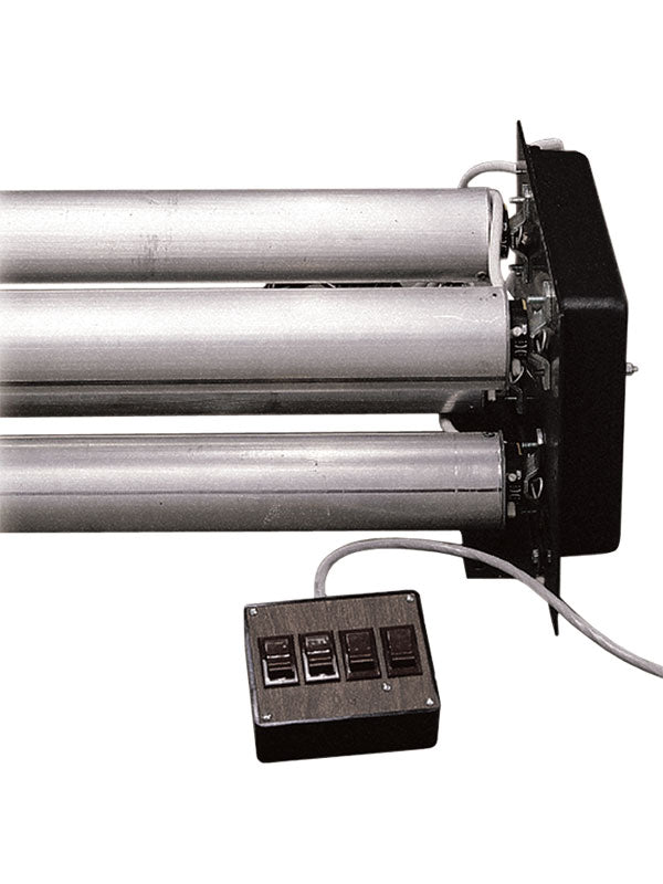
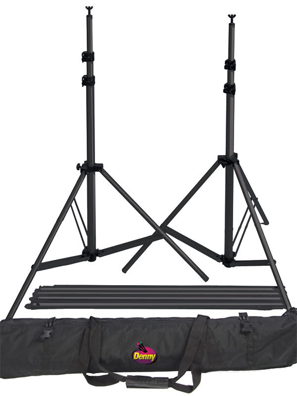
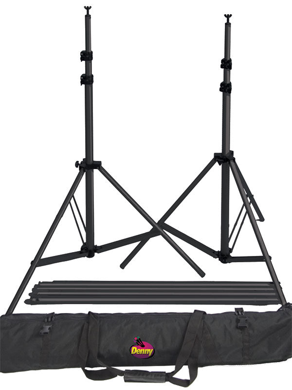
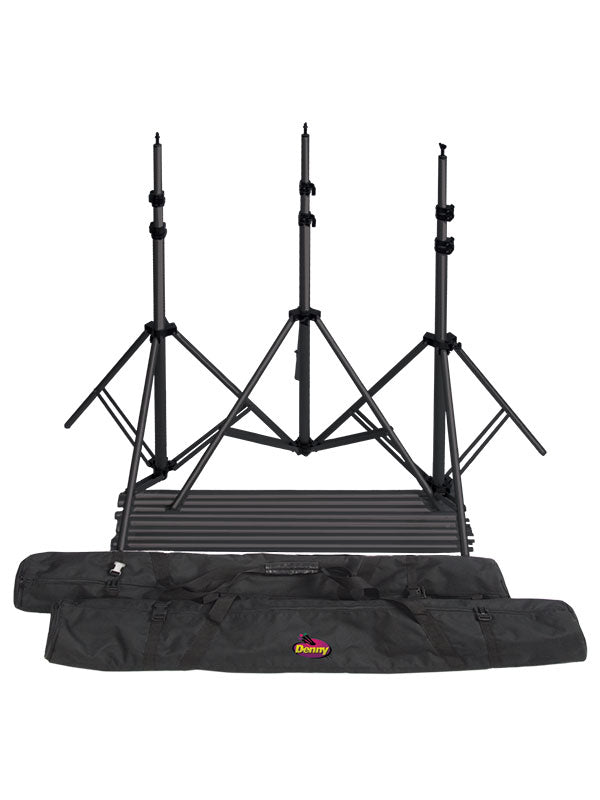
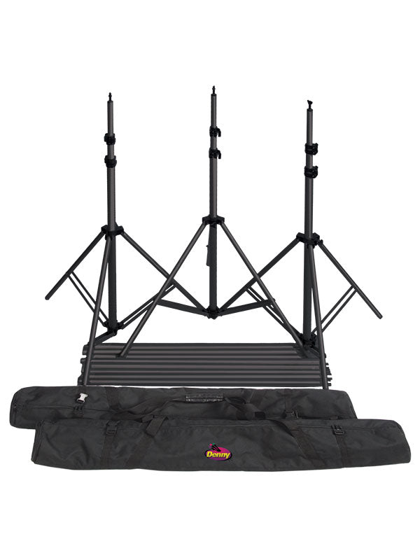
A premium painted backdrop is a working surface, not a disposable set piece. Give it a clean setup area and use a dependable support system sized for its width and weight. A secure crossbar, roller system, or appropriate stand arrangement helps keep the backdrop hanging smoothly and reduces unnecessary strain during setup.
Avoid placing clamps directly where they could mark or crease the painted surface. When the background needs to be secured, use the support method recommended for its material and make adjustments gradually. Pulling aggressively at one corner can distort the hang and make the painted pattern look uneven in camera.
Storage should protect the finish from moisture, dust, and sharp folds. Roll or fold according to the backdrop material and its care instructions, then keep it in a dry, temperature-stable area. Before an important session, inspect the surface under studio light instead of waiting until the client is on set. A few minutes of preparation prevents avoidable retouching later.
If a backdrop arrives with natural handling marks or needs time to relax after storage, allow it to hang before the session. Do not assume every crease should be treated the same way. Care methods vary by material, and excessive heat or moisture can damage a painted finish. When in doubt, follow the material-specific guidance rather than using a general fabric-care method.
Build a More Efficient Portrait Set
The strongest studio sets do not need to be complicated. A painted backdrop, a coordinated floor surface, one or two purposeful props, and dependable lighting can cover an impressive range of sessions. The key is choosing pieces that work together across your regular booking calendar rather than building a one-time set for every shoot.
Keep a neutral painted background available for the sessions that demand flexibility, then add distinct colors or deeper textures for specialty work. This approach gives clients variety while keeping setup familiar for your team. It also makes it easier to maintain consistent framing, light placement, and post-production across a gallery.
A well-chosen painted backdrop earns its place when it helps you create portraits that feel finished before the shutter is pressed. Set it with care, light it with intention, and let its texture do the quiet work of making the subject look their best.