

































A product can be perfectly lit and still look unfinished if the surface behind it does not support the shot. The right product photography backdrop styles establish scale, control reflections, reinforce brand color, and make a product appear intentional before any retouching begins. For commercial work, the backdrop is not a blank afterthought. It is part of the set.
The best choice depends on the product, the intended use of the images, and how often the setup needs to change. A matte white background may be right for catalog consistency, while a warm wood floor and lightly textured wall can give food, home goods, or handmade products more context. The goal is to select a backdrop style that helps the product photograph true without competing for attention.
Start With the Product's Visual Job
Before choosing a color or texture, define what the image needs to accomplish. Marketplace listings, ecommerce product pages, advertising campaigns, social content, and editorial photography do not always require the same treatment.
A clean, simple backdrop is usually the most efficient option when accurate color, clear outlines, and repeatable framing matter most. White, gray, black, and soft neutral backgrounds keep attention on the item and make it easier to maintain consistency across a large product collection.
Lifestyle-driven images need more environmental information. A jewelry maker may need a refined stone or plaster surface. A candle company may benefit from a weathered wood scene that adds warmth. Children's products often photograph well against gentle pastels or playful printed environments. In each case, the backdrop should support the product's customer story without making the set feel overbuilt.
Consider the product's finish as well. Glossy packaging, glass, chrome, and polished ceramics reflect everything around them. Smooth, non-reflective backdrop materials reduce unwanted highlights and give the photographer more control over the lighting pattern. Textured products such as linen, leather, wood, and matte cosmetics can tolerate more visual detail behind them, provided the texture remains secondary.
Clean Studio Product Photography Backdrop Styles
White and light neutral
White remains a practical standard for product photography because it delivers a clean, familiar presentation and works across many categories. It is especially effective for apparel, electronics, beauty packaging, footwear, and catalog photography. A true white sweep also provides the option to isolate a product cleanly in post-production when required.
White is not automatically the easiest choice, however. Bright reflective products can disappear against it, and translucent edges may need careful exposure. A light gray or warm off-white background often preserves separation while retaining the minimal studio look. Gray also provides a useful middle ground for products with white labels, pale finishes, or clear glass.
Black and deep tones
Black backgrounds create separation, shape, and a more premium visual mood. They are effective for bottles, watches, metallic tools, dark apparel, and products with bright labels or reflective edges. With controlled rim lighting, a dark backdrop can make polished surfaces look dimensional rather than flat.
The trade-off is detail management. A dark product against black needs edge light or a lighter surface beneath it to prevent the silhouette from losing definition. Use black when the product benefits from drama, not simply because the backdrop is easy to hide in a dark studio.
Gray, beige, and muted color
Neutral backdrops offer more character than pure white while remaining versatile enough for ongoing commercial work. Mid-gray is a particularly useful choice because it can look lighter or darker depending on exposure and light placement. Beige, sand, taupe, and soft clay tones bring warmth to wellness, skincare, food, stationery, and home product photography.
Muted color is often more usable than saturated color. A quiet blue, sage green, dusty rose, or warm mustard can establish a brand palette without pulling attention from the item. If a product is sold in multiple colors, a neutral backdrop makes collection-wide consistency easier to maintain.
Texture Adds Context Without Building a Full Set
Texture gives a product image a sense of place. It can suggest craftsmanship, comfort, durability, freshness, or a specific style of interior. The useful question is not whether a textured backdrop looks attractive on its own. It is whether its scale and detail are believable at the camera distance you plan to use.
Wood, concrete, and stone surfaces
Wood-style photography flooring works well for food, tabletop goods, kitchen products, seasonal merchandise, and rustic brands. Light wood keeps a scene open and casual, while darker planks create contrast for lighter products. Look for natural grain that photographs clearly but does not become a distracting pattern.
Concrete, cement, and plaster styles are reliable choices for modern, industrial, and minimalist product lines. They pair well with cosmetics, fitness products, accessories, ceramics, and contemporary packaging. A smooth, non-reflective finish is especially helpful when shooting glass or metallic items, since it keeps reflected texture from appearing too sharp in the product.
Stone, marble, and tile styles can add polish to beauty, fragrance, jewelry, food, and bath products. These surfaces need restraint. Strong veining can look refined in a wider lifestyle composition, but it may compete with small products in a tight crop. For close-ups, choose a quieter pattern or shift the product away from the most active area of the print.
Fabric, paper, and hand-painted texture
Fabric backdrops create softness that hard surfaces cannot. Linen-like finishes, draped cloth, and subtle woven textures suit skincare, boutique goods, apparel accessories, and handmade products. Their folds can introduce natural shadow and dimension, but they should be arranged deliberately. Random wrinkles often read as accidental rather than tactile.
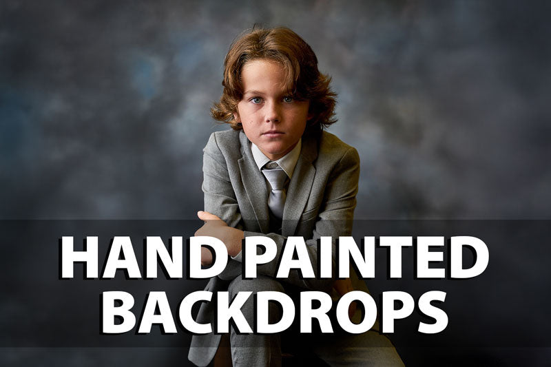
Hand-painted canvas and muslin backdrops give photographers controlled color variation with a refined studio appearance. These styles are useful when a flat solid color feels too plain, yet a printed scene would be too literal. Soft painted transitions can support a product while keeping the background visually quiet.
Paper is a strong option for smooth color fields, quick color changes, and tabletop sweeps. It photographs cleanly when handled carefully, but it can show scuffs, creases, and spills faster than more durable materials. For frequent production work, choose the material based on how much handling, cleaning, and repositioning the set will require.
Use a Floor and Background Together
Many product images improve when the background includes a believable horizontal surface. A backdrop alone can feel flat when a product needs to sit, stand, or cast a natural shadow. Coordinating a vertical background with photography flooring creates a complete scene and establishes a clear floor plane.
The pairing does not need to match exactly. A soft plaster wall with pale wood flooring may look more natural than a wall and floor with identical patterns. What matters is that their colors, perspective, and texture scale work together. Non-reflective floor drops that replicate brick, concrete, stone, tile, or wood can provide realistic texture detail while keeping glare under control.
For tabletop work, let the surface extend slightly behind the product or use a curved sweep where the wall and floor meet. This eliminates a hard horizon line when a floating studio look is needed. For a more environmental style, retain the seam and use it as part of the composition.
Match Material to Workflow
The visual style matters, but material affects daily studio efficiency. Printed vinyl is easy to wipe down and useful for food, drink, cosmetics, and any set where spills are possible. Cloth and canvas options can offer a softer appearance and fold for storage, although they should be smoothed and mounted carefully to avoid visible creasing.
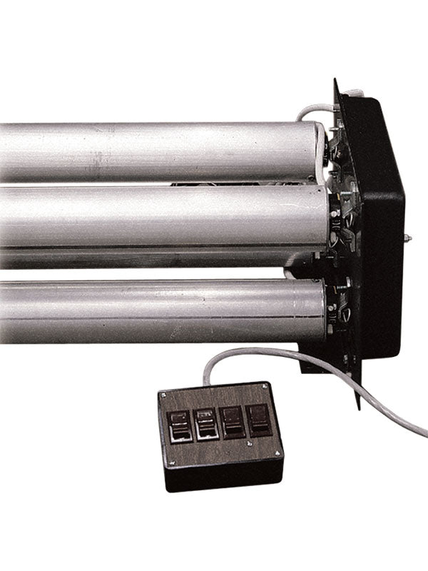
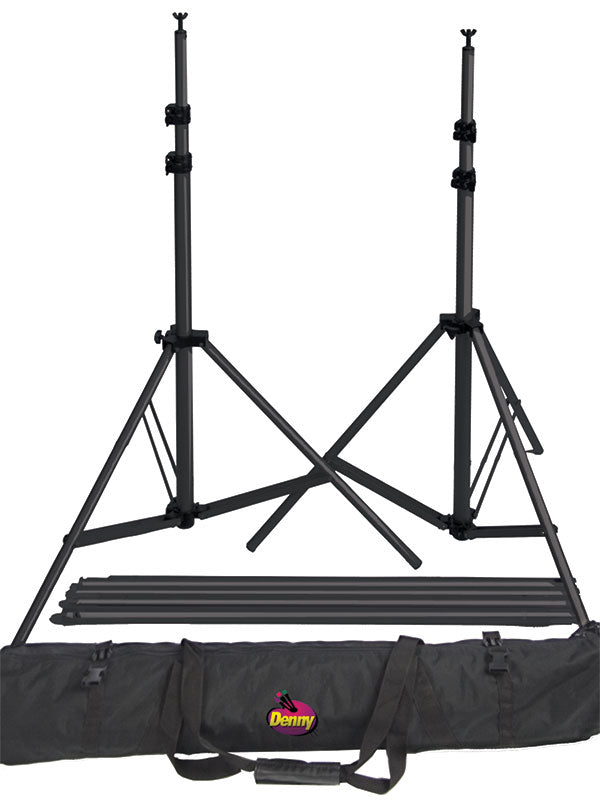
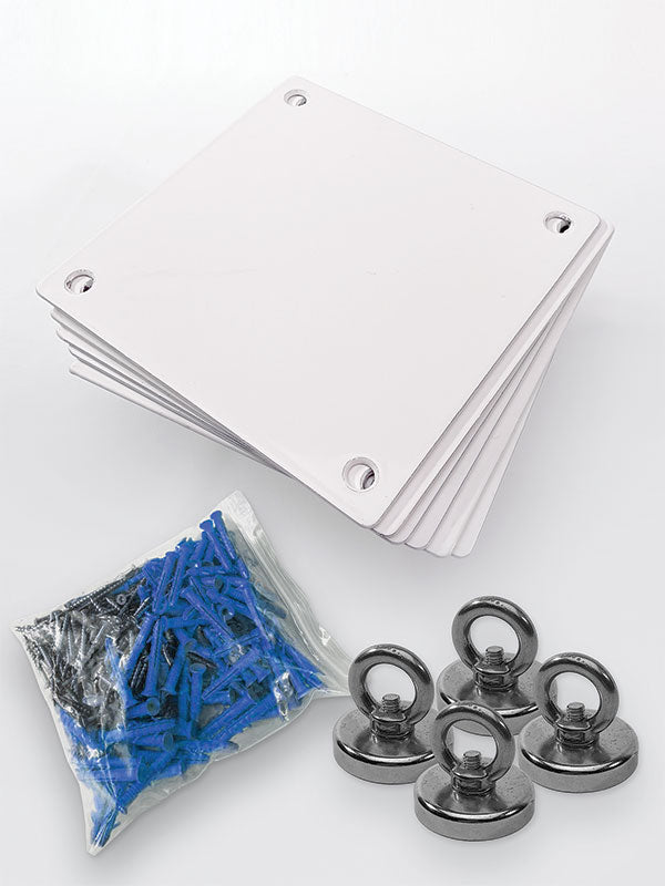
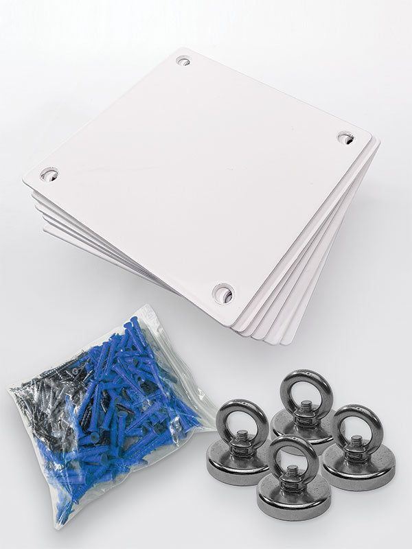
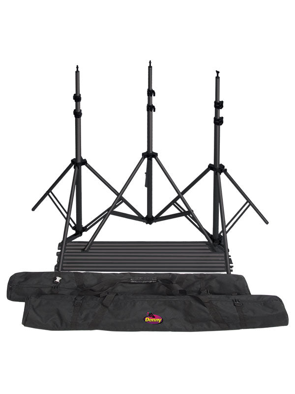
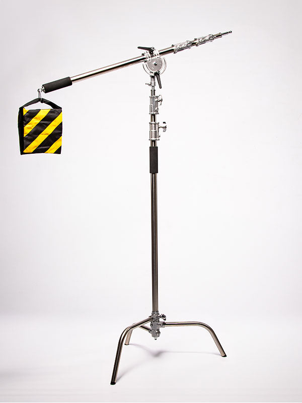
Collapsible backdrops are practical for smaller product sets, quick location work, and studios with limited storage. Larger rolls, hanging backdrops, and support-mounted systems are better suited to recurring campaigns, wide sets, and products photographed at multiple angles. A secure backdrop support system matters as much as the background itself when working with wide materials or building a floor-to-wall setup.
Denny Manufacturing offers materials and visual environments designed for photographers who need both variety and dependable studio performance. When selecting any backdrop, consider its working size, mounting method, storage needs, and how the finish behaves under the lighting you use most often.
Keep Color and Lighting in the Same Plan
A backdrop can look completely different under daylight-balanced flash, continuous LED lighting, or warm ambient light. Photograph a quick test before committing to a full product run, especially with cream, gray, blue, and green backgrounds. Small shifts in white balance can make a neutral surface look yellow, purple, or green.
Use the backdrop to shape light, too. White surfaces bounce fill back onto a product, while black surfaces absorb it and deepen shadows. Pale wood and beige tones add warmth through reflection. If accurate product color is critical, keep colored bounce sources controlled and use flags or white cards where needed.
A good backdrop should make production easier: fewer distracting reflections, cleaner edges, believable shadows, and a consistent visual language across the collection. Choose the style that serves the product first, then build enough variation into your backdrop selection to keep each campaign fresh without losing the recognizable look your clients expect.


