
































A school portrait schedule leaves little room to correct a poor set choice. When hundreds of students move through the camera position, school picture day backgrounds need to hold color under consistent lighting, work across grade levels, and stay clean-looking from the first subject to the last. The best option is rarely the busiest one. It is the background that supports the student, photographs true without glare, and keeps the workflow moving.
Choosing School Picture Day Backgrounds for Volume Work
School photography is its own production environment. A backdrop may need to serve kindergarten students in the morning and graduating seniors later in the day, often in the same camera position. That makes versatility more valuable than a design built around one narrow trend.
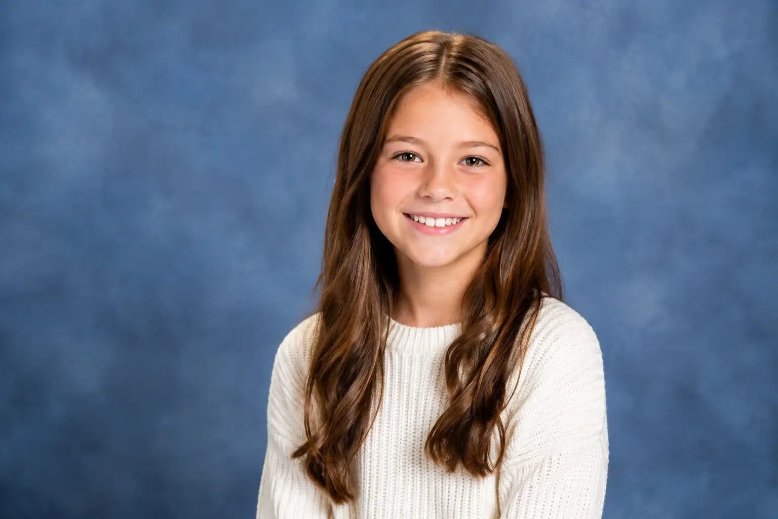
Start with the visual goal. A classic portrait program generally benefits from a soft, neutral studio-style background with gentle tonal variation. Blue-gray, charcoal, warm gray, muted brown, and subtle painterly textures provide separation without competing with clothing, school uniforms, eyeglass frames, or skin tones. These choices also make package designs and yearbook layouts easier to coordinate.
A more contemporary program may call for brighter color, light wood textures, painted wall effects, or a clean modern interior look. These can work well when the school wants a fresh identity, but the texture should remain controlled. Strong patterns, oversized graphic elements, or high-contrast detail can pull attention toward the set and away from the student's expression.
The practical question is not simply whether a background looks attractive in a product image. Ask whether it will look equally good behind a student in a white shirt, a dark hoodie, a bright dress, and a team uniform. A background with a clear middle value and moderate contrast usually performs well across that range.
Keep the Student as the Focal Point
Portrait backgrounds should create depth without creating distraction. Soft mottling, graduated color, out-of-focus scenic effects, and fine natural texture can add dimension at camera distance. They give the image a finished appearance while keeping facial features and expression central.
Be careful with detail placed near head and shoulder height. Faux windows, bold brick patterns, hard horizon lines, and dense foliage can intersect awkwardly with hair and shoulders. If a printed scene has architectural or environmental detail, position it so the quietest area falls behind the subject's head. This small consideration reduces awkward tangencies and retouching time.
Color matters just as much. Deep black or very dark backgrounds can look polished for a specific senior portrait style, but they may lose detail in dark hair or dark apparel unless the lighting is carefully controlled. Very pale backgrounds can create a clean, open result, though they may require more separation for light hair and light-colored clothing. Midtone designs give photographers more latitude during a fast school day.
Select the Right Material for Your Setup
The material behind the image affects setup time, lighting behavior, storage, and long-term appearance. For school volume photography, a smooth, non-reflective finish is a working advantage. It helps the background stay even under studio strobes and reduces bright hotspots that can slow post-production.
Printed fabric backgrounds are a practical choice for photographers who travel from school to school. They are lightweight, fold down for transport, and can provide realistic texture detail without the bulk of rigid scenic components. A quality fabric print should remain matte and photograph consistently across the frame.
Canvas and hand-painted backgrounds bring visual depth and a refined studio feel. Their tonal variation can be especially effective for traditional school portraits, senior sessions, and formal faculty photography. They are best suited to photographers with a dedicated studio setup or a transport plan that protects the material and allows it to hang smoothly.
Vinyl can be useful when easy cleaning is a priority, particularly for younger grades or themed event stations. Its surface should be assessed carefully under the intended lighting. Some finishes can reflect more than fabric or canvas, while a matte, non-glare option is designed to keep the printed artwork visible rather than bouncing light back into the lens.
Collapsible backgrounds are well suited to compact camera stations and quick transitions. They offer a ready-to-use surface with minimal floor space, but size is the deciding factor. A collapsible panel may be ideal for tight head-and-shoulders portraits, while full-length or group applications require a wider and taller solution.
Match Background Size to Crop and Camera Position
A background that is too narrow becomes a problem the moment a student leans, turns, or is photographed in a wider crop. Plan for the actual framing, not the tightest possible headshot. For seated poses, three-quarter portraits, staff portraits, sibling groups, or student organization photos, extra width provides welcome flexibility.
Height matters when photographers vary camera elevation or need room for taller students. Make sure the backdrop extends beyond the final crop on every side. This protects the image from exposed wall edges, support hardware, and uneven coverage when subjects do not stand in exactly the same position.
For photographers using a floor plane, the backdrop and flooring should work as a single set. A matching or complementary floor drop creates a natural transition below the subject and prevents the floating look that can occur when a wall-style background ends abruptly at the floor. Non-reflective flooring that replicates wood, concrete, stone, or a neutral studio surface can add believable depth without producing distracting shine.
Build a Set That Repeats Consistently
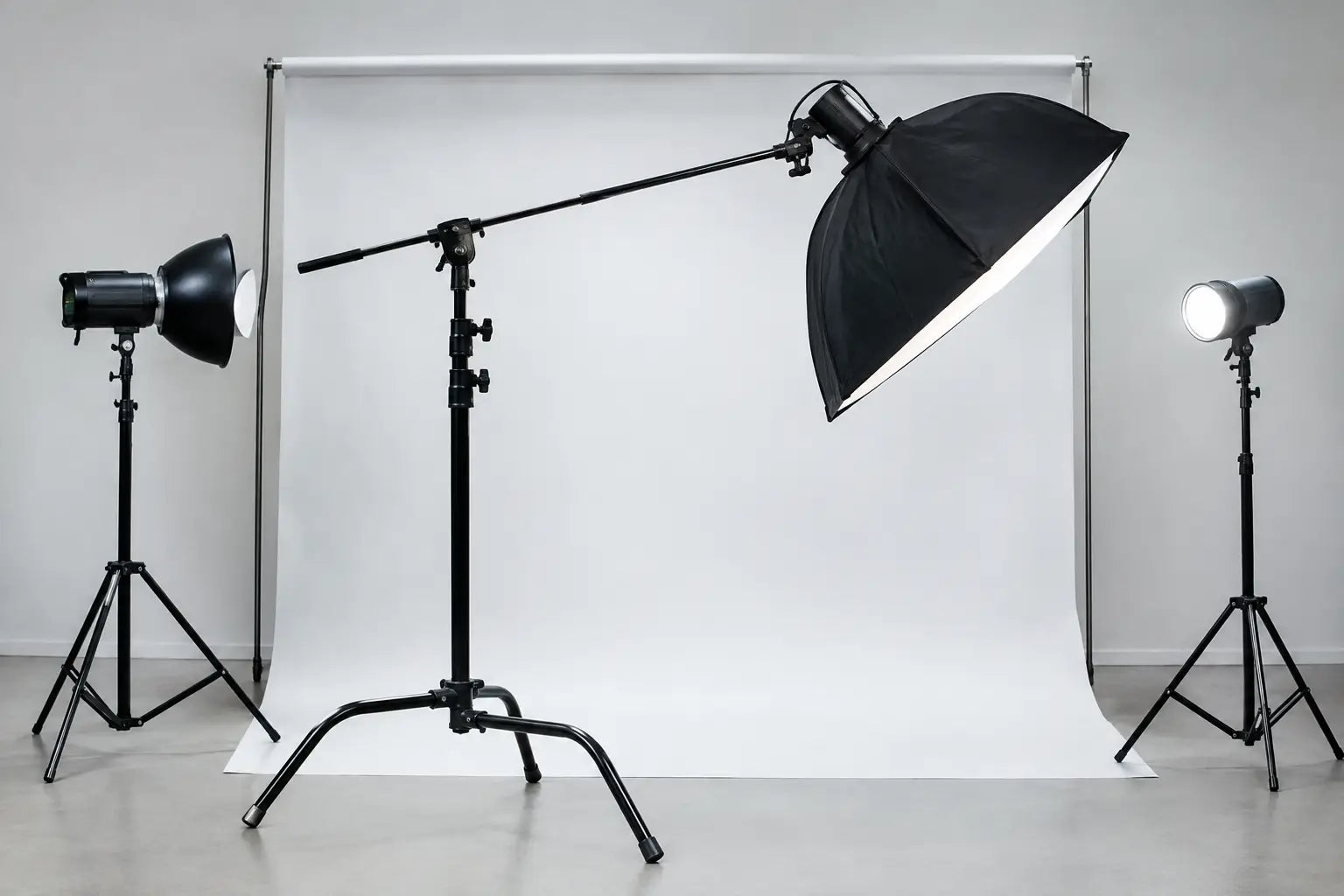
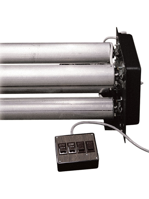
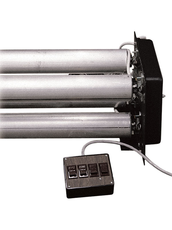
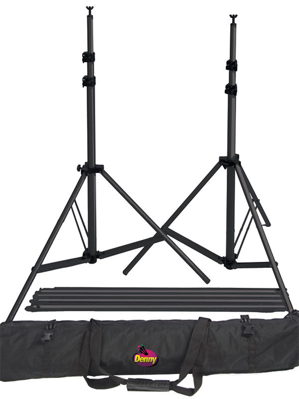
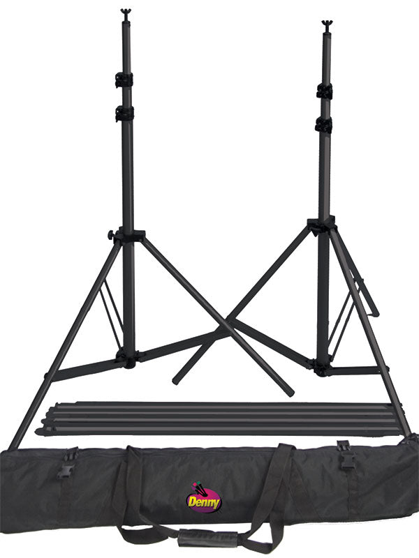
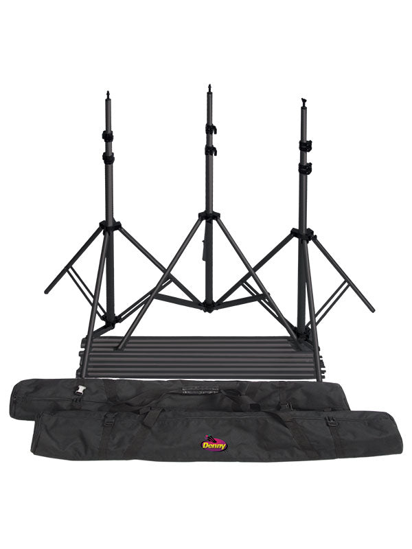
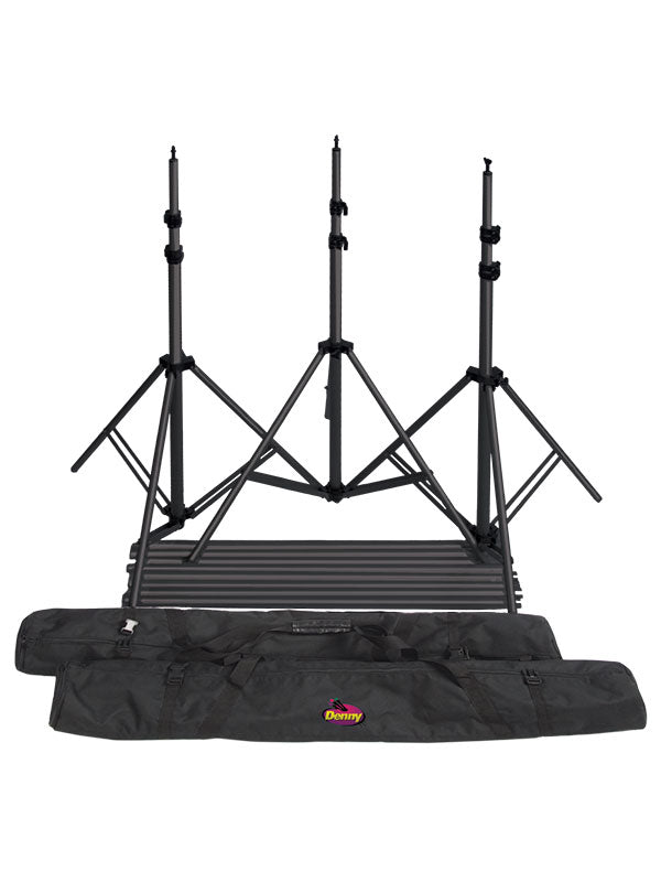
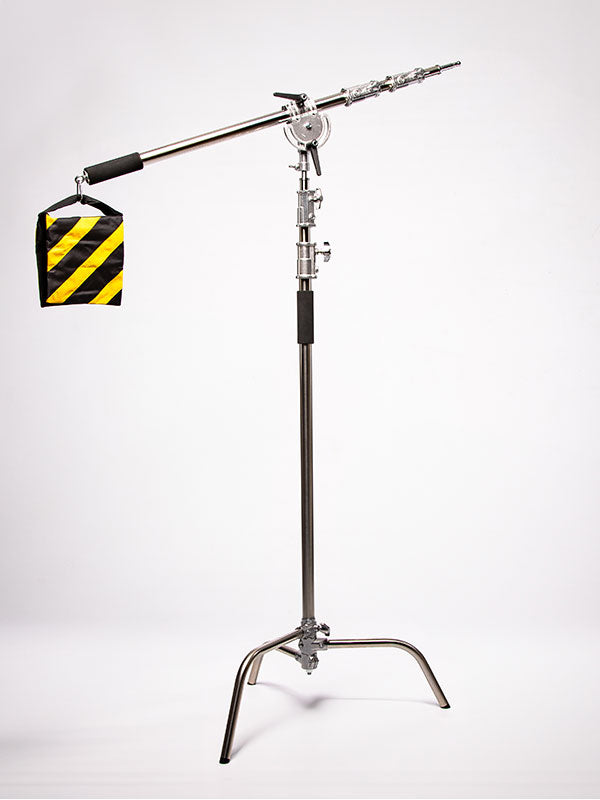
Consistency is the product in school volume work. Once the portrait position is approved, the background, support system, subject mark, camera height, and lighting should stay fixed. A dependable backdrop support system keeps the material taut and correctly placed, even when the setup must be assembled in a gymnasium, library, multipurpose room, or hallway.
Avoid treating the background as an afterthought to the lighting. Set it at enough distance from the student to control shadows and preserve separation. The exact distance depends on the modifier, room size, and desired depth, but even a modest gap can keep the background from receiving harsh spill. If the look calls for a brighter background, light it intentionally rather than relying on uncontrolled bounce from the key light.
Before the first student arrives, photograph several test frames. Include subjects or stand-ins with light and dark clothing, varied hair colors, and eyeglasses. Check for glare, color casts, distracting folds, visible edges, and background exposure shifts. A few minutes of testing can prevent a full day of files that require avoidable correction.
Keep a backup option on hand when possible. Schools have unpredictable room conditions, and the assigned space may have less width or lower ceilings than expected. A second neutral background or compact collapsible setup can preserve the schedule if the primary set will not fit cleanly.
Choose Designs That Age Well
School portraits stay in yearbooks, family homes, graduation displays, and alumni records. A background can feel current without being so tied to a short-lived design trend that it dates the image immediately. Soft studio textures, restrained environmental effects, classic colors, and realistic natural surfaces tend to remain useful over multiple seasons.
This does not mean every school program should look identical. Elementary schools may respond well to lighter color and a friendly visual feel, while middle school and high school programs may favor more refined tonal depth. The key is to adjust the mood while preserving the same professional priorities: controlled texture, appropriate scale, clean edges, and reliable color reproduction.
Seasonal sets and school-branded graphics have a place when the program calls for them. A custom background can support a mascot, anniversary, fundraiser, or special event, especially when it is designed with a clear area for the portrait subject. Keep logos and text away from the head-and-shoulder zone, and confirm that the graphic will remain readable in the final crop sizes.
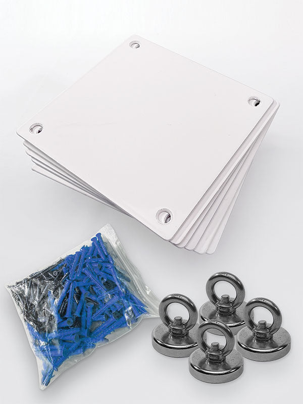
Denny Manufacturing offers backdrop materials and support options that allow photographers to build school sets around the space, crop, and visual style they actually use. The right combination is one that arrives at the camera position ready to work, not one that creates new technical problems on portrait day.
A well-chosen school background does more than fill the frame. It gives every student a consistent, polished setting, lets the photographer maintain pace, and leaves families with a portrait that still feels right years later.